Project Overview


Project Details
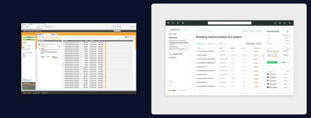
SecuTray, a cloud provider based in Germany, partnered with us to elevate the experience of their secure file sharing web application. The feature-set includes file browsing, preview and task management as well as advanced role, authentication and authorization settings.
The project focused on modernizing the application appearance, enhancing navigation and discoverability. The overhauled interface featured an upgraded visual identity that was designed for customizability, so B2B clients could apply their own brand.
Objective & Solution
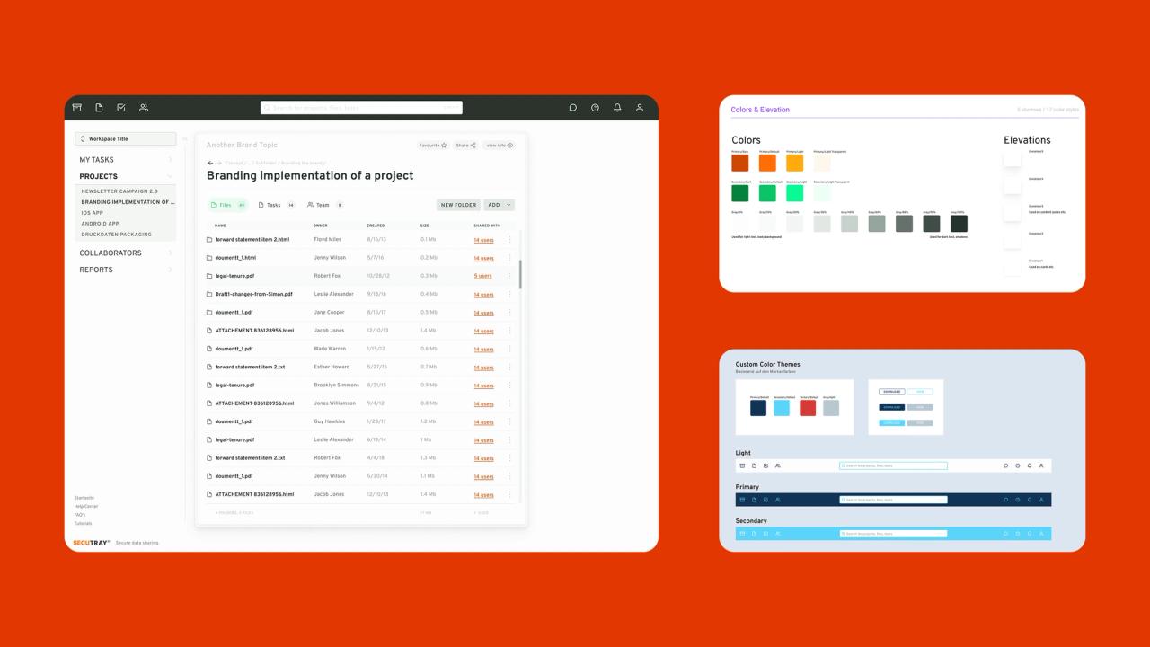
The objective was to upgrade the brand while preserving its core identity, which customers valued and trusted. A facelift introducing less opinionated shapes, modern typography, and restrained color use modernized the look and feel while facilitating interface customization. To accommodate whitelabeling by B2B customers, we designed a reduced and neutral interface with high contrast and adaptive color application, ensuring it remains aesthetically pleasing with various corporate colors and logos of different shapes and sizes.
We addressed the challenge posed by the original brand colors, which conflicted with essential alert colors, by developing a custom palette of accessible and distinguishable alert colors to enhance clarity and usability.
Furthermore, we refined the interface for complex security settings, simplifying the layout to emphasize basic content and strategically placing advanced functionality to prevent unintended changes.
Project Outcomes Link to this headline
Enhanced User Experience
The intuitive interface allows for easier navigation and accessibility.
Modern Interface Design
Transitioned to a clean, modern look that aligns with current design trends and user expectations.
Customizable Whitelabel Features
Implemented flexible branding options that enable clients to personalize the application, promoting a seamless user experience for their employees.
Project Deliverables Link to this headline
The following are some of the deliverables that were created for this project.

Brand Facelift
DesignDeveloped a neutral, adaptable brand identity, paving the way for easy client-specific customization.

User Interface Enhancements
User ExperienceRedesigned the UI to improve usability and ensure the interface is engaging and easy to navigate.

Custom Themes
DesignBrand and interface colors were defined to allow easy theming.

Whitelabel Integration
DesignIntegrated a system allowing clients to apply their branding to the platform, enhancing the personalized user experience.


