Project Overview


Project Details
Defining a UX Strategy and unifying the User Interface design to improve navigation, discoverability and usability of the application.
Objective & Solution
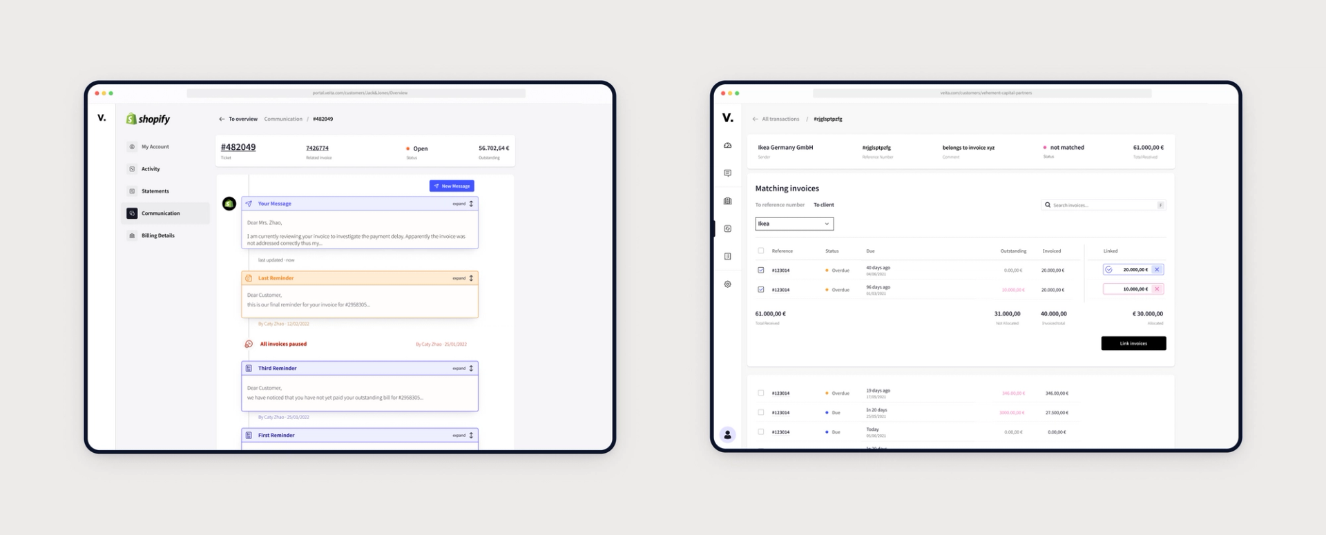
The Veita application offers an audit trail to document and automate communication between companies and their clients around invoices and payment reminders.
We were asked to simplify and consolidate key interfaces and align actions and feedback across multiple features and touchpoints to focus the experience on its key scenarios.
Project Outcomes Link to this headline
Focussed experience
Unifying screen layouts to reduce mental friction and enable faster discoverability of important actions.
Customized Workflows
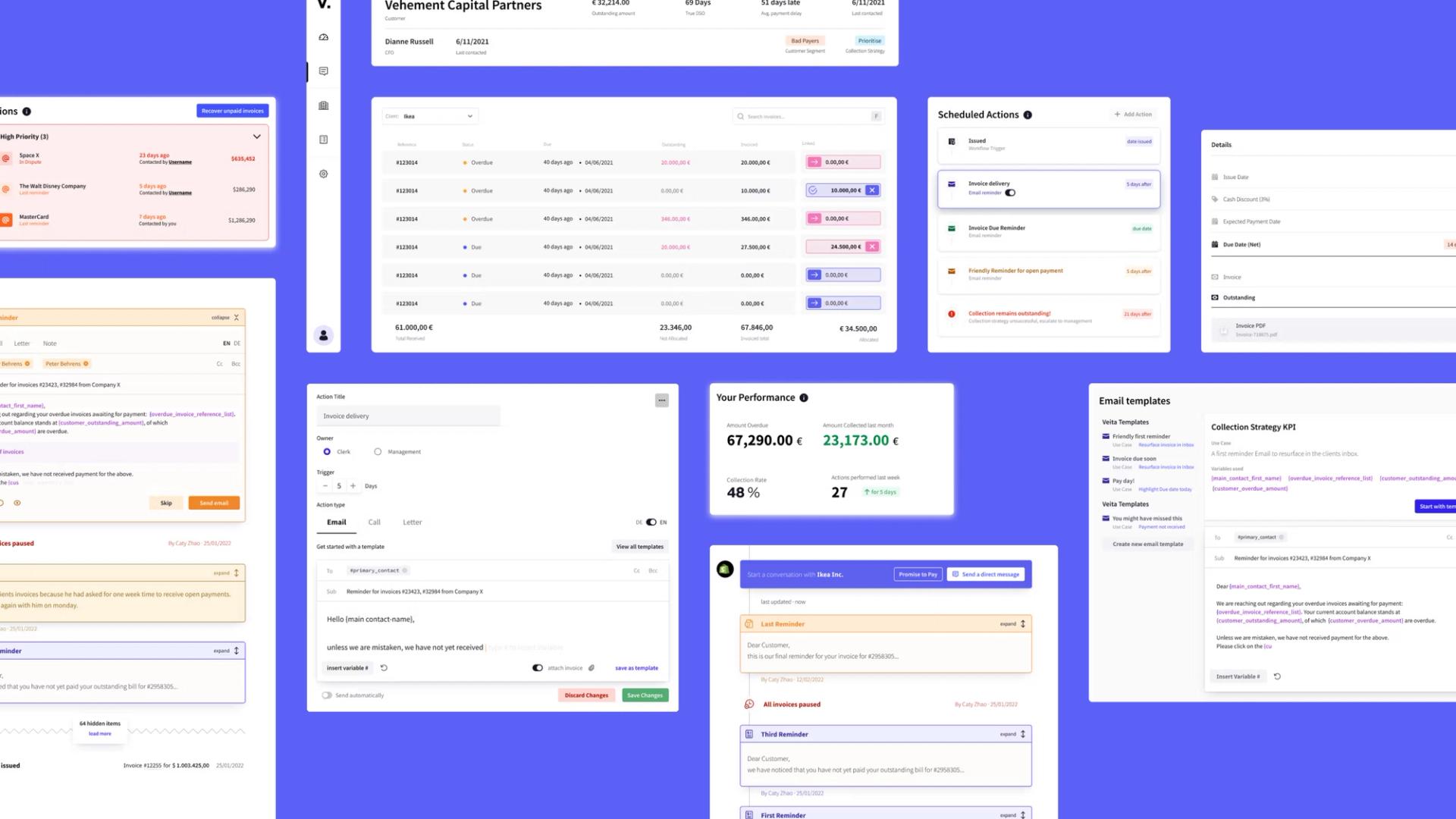
This new feature allows users to create customized reminders schedules and automate actions to increase the likelihood of on time payment.
Customer portal to manage payments
A new interface allows customers to manage outstanding payments and communicate with the issuing company about payment terms, due dates and causes for delay.
Testimonial
The team helped us to collect early user feedback to validate our assumptions and deliver a solution that actually surpassed our customers expectations.
Project Deliverables Link to this headline
The following are some of the deliverables that were created for this project.

Information Architecture
Product StrategyWorking with existing layouts and navigation we reverse engineered and improved the Information architecture to present complex features in easy to grasp categories and clusters.

New Customer Onboarding Timeline
Product StrategyCompiling and sequencing of all parallel and consecutive steps to map touchpoints and highlight core challenges of the user journey.

User Flows
User ExperienceMapping of all interactions and responses that a user is going to encounter during each of the main workflows. Awareness of all required steps and conditions motivates deliberate design choices and highlights frictions and inconsistencies.

Wireframes
User ExperienceLow fidelity representations of key interfaces to align stakeholders, collect feedback and establish a joint understanding of opportunities and challenges.

UI Design
DesignA complex set of features was designed based on a set of core design components. The resulting interface elements where docmented in an extendible and modular design system.


