Project Overview


Project Details
- Duration
- 2 weeks
- Tools
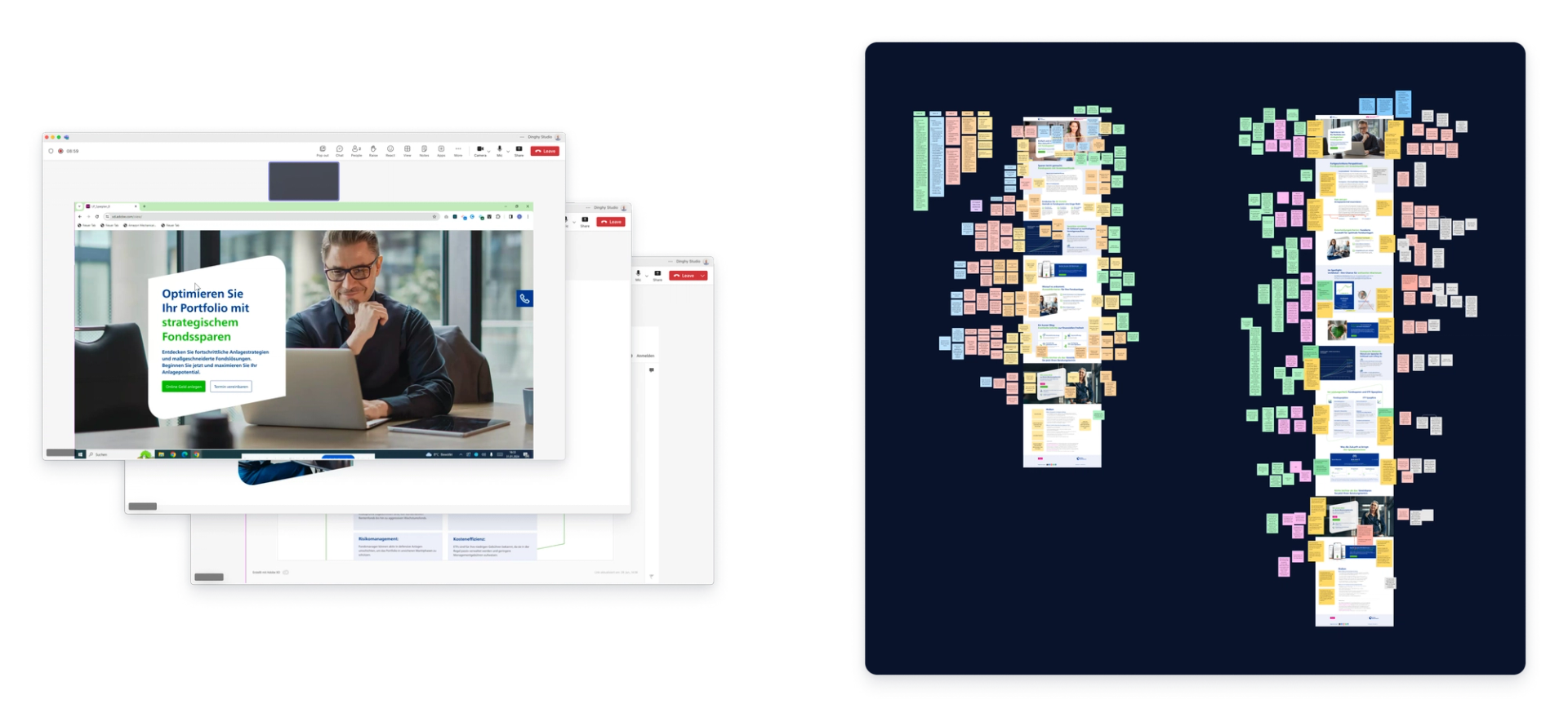
Following an in-depth discovery research phase with banking clients, our design team crafted two specialized landing pages aimed at distinct target audiences. This strategic move was rooted in insights that pinpointed varied needs within our user base. To validate and refine these landing pages, we conducted Rapid User Testing, ensuring the final designs were both user-friendly and conversion-optimized .
Objective & Solution
The primary goal was to rigorously test and validate the design of two newly created landing pages. The insights gained from this testing were instrumental in refining the landing pages, ensuring that the final designs were not only based on theoretical research but also on empirical evidence of user satisfaction and performance.
Participant Recruitment Process Link to this headline
Our study engaged with ten participants, all of whom are already customers of said German bank. Recruitment was completed in four days, individuals were selected according to the following criteria:
- 5 investors with prior experience and 5 newcomer investors
- Proficiency in German and residing in Germany
- Aged between 30 to 45 years
- Existing customers of Volksbank with prior experience in using Volksbank for investment purposes
User Testing Link to this headline
Usability testing is like taking the scenic route home, you notice all the things you didn’t see before. To validate the effectiveness of the two distinct landing pages, a structured user testing was implemented. Participants, selected based on their alignment with the target audience of each page were assigned tasks that mirrored typical user behavior. Key performance indicators (KPIs) such as task completion rate, time on page, and conversion actions were measured. Additionally, qualitative feedback was collected through post-interaction interviews, focusing on the users' overall experience, clarity of information, and navigational ease. The gathered data was then analyzed to identify patterns, preferences, and areas for improvement, providing a clear direction for refining the landing pages to better meet user needs and enhance the conversion funnel.
Top 3 UX Research Insights That Saved Us from Disaster Link to this headline
Explanation of Complex Terms Link to this headline
Users struggled with jargon and complex terms. They wanted clear explanations and links to detailed definitions on a separate page. Making terminology accessible is crucial for usability.
Building trust Link to this headline
Testimonials from individuals are a universal means of building trust with users. However in this case that did not work. Instead, they preferred endorsements from respected financial magazines, former clients, or reputable companies. This shift in approach significantly increased credibility.
Reorder the Landing Page Link to this headline
Usability testing revealed that the current layout didn’t match user priorities. Reordering sections based on user input ensured the content flow aligned with their needs. This insight could only come from directly engaging with users.
Project Outcomes Link to this headline
Empirical Validation of Design Choices
The methodology of user testing provided empirical evidence that informed the optimization of the landing pages, ensuring that design decisions were grounded in actual user behavior and preferences.
Improved Information hierarchy
Adjustments to the page hierarchy, positioning essential information at the top, directly responded to user needs. This change led to users finding relevant information faster, enhancing the overall user experience and efficiency in navigating the landing pages.
Authentic Visuals Critical for User Trust
The use of stock imagery on the landing pages was identified as a barrier to user trust and engagement. Users expressed a preference for genuine, relatable images that accurately represent the services offered, underscoring the need for visuals that resonate with the target audience's expectations and experiences.
Project Deliverables Link to this headline
The following are some of the deliverables that were created for this project.

Design Refinement Plan
Product StrategyA strategic plan outlining specific design adjustments and optimizations based on user testing feedback, aimed at enhancing user engagement and conversion.

Findings Pitch Deck
Product StrategyA comprehensive deck summarizing findings on 45 slides, categorized for easy understanding and action planning.

UX Design Recommendations
DesignA set of UX design guidelines derived from user feedback, aimed at enhancing the usability and appeal of landing pages.

Q&A Session
Product StrategyAn interactive session addressing stakeholder questions, clarifying the proposed enhancements, and aligning on the project’s objectives and implementation steps.
Project Milestones
Research
- Interview Guide
- Usability Tests
- Analysis
Documentation
- Recommendations
- Report
- Stakeholder Presentation


