Minimize Customer Support. Maximize Revenue.

Increase happiness and retention with your customers, to save your organization time, resources and expenses.

See how it works
  • Real-Time Video Podcasting Production Studio
  • A Business platform to distribute digital mastercards
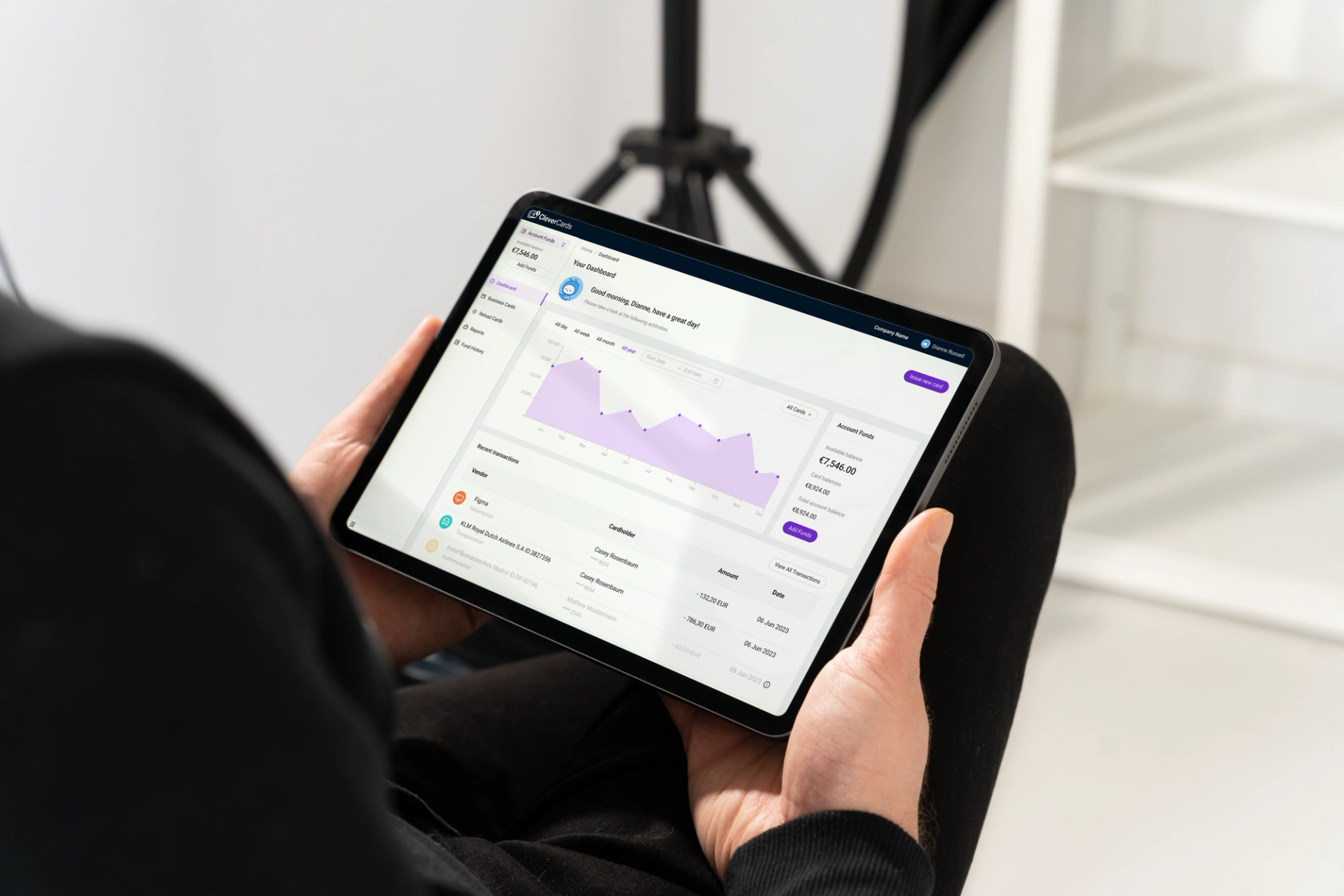
  • Redesign Clevercards to present digital expense management

We work with startups that work with these companies

  • Logo of Oracle
  • Logo of Apple
  • Logo of eBay
  • Logo of Deloitte
  • Logo of Roland Berger
  • Logo of Amazon
  • Logo of Vodafone
  • Logo of Microsoft
  • Logo of Kelloggs
  • Logo of Booking.com
  • Logo of Bank of Ireland
  • Logo of Zurich
  • Logo of Accenture
  • Logo of PwC
  • Logo of Oracle
  • Logo of Apple
  • Logo of eBay
  • Logo of Deloitte
  • Logo of Roland Berger
  • Logo of Amazon
  • Logo of Vodafone
  • Logo of Microsoft
  • Logo of Kelloggs
  • Logo of Booking.com
  • Logo of Bank of Ireland
  • Logo of Zurich
  • Logo of Accenture
  • Logo of PwC

The Problem

Bad User Experience Slows Down Your Support Staff

Every time a customer is stuck, someone in your business will have to deal with their challenge.

Each incidence will have a negative impact on your reputation.

Plus you’re not working on your product during that time.

  • Frustrated customers file angry support requests

  • Scaling a Support Team is expensive and complex

  • Support requests decrease your ratings

Testimonial

Your UX work made our lives and more importantly our customers lives way easier!

The new onboarding and the buyer journey within the portal including the payment flow was a good success - thank you for your support in the run up.

Company logo

Project Show Case

A Business platform to distribute digital mastercards

Cover Image for A Business platform to distribute digital mastercards

The client’s business portal, initially created by the engineering team under tight deadlines, left customers dependent on sales staff for common tasks. An anticipated surge in holiday sales, the support team faced potential overwhelm.

Focusing on accountants at large corporations, we conducted rapid usability testing and feature discovery to prioritize key features. The goal was to enable users to self-serve effectively.

Collaborating closely with the product and engineering teams, we developed a self-explanatory UI that could be easily implemented. From concept to implementation, the redesign was completed just in time for the client to meet their ambitious holiday sales goals.

Project Outcomes

  • Reduced customer support

    Customers had access to self-service platform to reduce support requests by 60%

  • Happier Customers

    By making the product more intuitive to use, the customers could self-serve much better without having to rely on support team.

  • Increased Revenue

    Because customers could self-serve to a much higher degree, the support staff was no longer the limiting factors to revenue which in turn increased by +30%.

Project Deliverables

The following are some of the deliverables that were created for this project.

  1. Deliverable

    UX Concept

    Product Strategy

    Integrated two product portfolios into an online platform for diverse payouts, involving regulatory and technical analysis, user research, and stakeholder roadmaps, including KYC and KYB.

  2. Deliverable

    Competitor UX Audit

    User Experience

    Detailed breakdown of CleverCards' competitors and their product's features to able to set the product apart and enable strategic decision making with regards to the product development roadmap.

  3. Deliverable

    User Flows

    Product Strategy

    Design of user flows across all phases of the product lifecycle. Indirections are surfaced and can be alleviated before digital processes are implemented. This leads to intuitive and streamlined experiences for new and existing users while complying with regulatory requirements.

  4. Wireframes

    Product Strategy

    Blueprint for each page which enables all teams to start work in parallel: UI design, copywriting, creating of visual content and web development all know what to do based these schematic

  5. Deliverable

    Interactive Prototype for User Testing

    User Experience

    To validate assumptions made during the concept phase we setup a clickable prototype of the website.

    This prototype was used to run rapid user tests with CFOs and HR practitioners.

    The feedback we received was implemented and helped improved the design user experience drastically..

  6. Deliverable

    UI Design

    Design

    Created visually appealing and user-friendly interfaces for Clevercards business portal. We focused selecting colors, typography, icons, and arranging elements to provide an intuitive and aesthetically pleasing user experience.

How it works

Fast turnover with high quality results and minimal involvement from your side

  • 1

    Schedule Free
Consultation

    We hop on a quick call and listen to you describe your challenge.

    Understanding your business and current challenge is very important to us.

  • 2

    We do the heavy lifting and handle details

    Based on your briefing we hit the ground running and work on the solution to your challenge.

  • 3

    Knowledge Hand-Over and Q&A

    During our hand-off session we present to solution we’ve arrived at and you get to ask all the questions you like, to make sure you and your team are able to work with what we have provided.

Exceptional Value, Fixed Price

We offer our services at competitive prices through risk-free, fixed price packages with no hidden costs.

  • UX Boost

    Quickly identify and address key usability issues with expert insights and design recommendations.

    4.800 EUR

    • Stakeholder Interviews: Quick insights from key team members

    • User Data Analysis: Review support tickets and user feedback

    • Heuristic Evaluation: Identify major usability issues

    • Expert Review: Detailed assessment of interface design best practices

    • Design Recommendations: Wireframes or mockups for key improvements

    • Presentation & Handoff: Clear explanation of findings and next steps

    7 days lead time.

    New spots available in Q1.

  • Qualified UX Overhaul

    Best Value

    Structured analysis and validated improvements for a transformative user experience.

    12.000 9.600 EUR

    • Stakeholder Interviews: In-depth research to uncover common time-sinks

    • User Data Analysis: Detailed review of support tickets and user feedback

    • Heuristic Evaluation: Thorough identification of usability issues

    • Expert Review: Comprehensive assessment of user flows and interface design

    • Usability Testing: Conduct tests with actual customers to validate changes

    • Recommendations Report: Validated and prioritized action plan for improvements

    • Presentation & Handoff: Presentation of project insights and expert Q&A

    3 weeks lead time

We guarantee measurable improvement in user experience and a reduction in support requests if you implement the action plan. If you don't see reduction in support requests within 3 months, we will provide additional consultation at no extra cost.

FAQs

Many people ask us one of the following when hearing about UX as a conversion driver for the first time.

  1. What services does your digital agency offer for fintech companies?

    We provide a comprehensive range of services, including website design and development, mobile app development, UX/UI design, digital marketing, and custom software solutions tailored specifically for fintech businesses.

  2. How do you approach UX/UI design for fintech applications?

    We prioritize user experience and user interface design to create intuitive, user-friendly fintech applications. Our design process involves thorough research, prototyping, and user testing to ensure the best possible experience for your customers.

  3. Can you help us with regulatory compliance in the fintech industry?

    Yes, we have experience working with various regulatory requirements in the fintech sector. Our team ensures that your digital solutions are compliant with all relevant regulations, such as GDPR, PCI DSS, and others.

  4. Does testing with real users really help the outcome?

    Absolutely!

    It's actually pretty mind-blowing how much we learn with testing with just 3-5 people. Even after years of experience designing digital experiences, there's always a case the requirements did not consider.

    The human mind is beautiful but wondrous place.

  5. How do you ensure the security of fintech projects?

    Security is our top priority. We implement industry-leading security measures, including data encryption, secure authentication protocols, regular security audits, and compliance with financial regulations to ensure your projects are safe and secure.

Is this for me?

Do any of the following facts sound familiar to you?

  • Too many support requests to handle

    Are you drowning in customer requests and support tickets?

  • Training support staff takes time

    Onboarding new team members is yet another layer of cost and time...

  • Customers are quickly frustrated

    Do your customers call you frantically after not getting what they came for?

We get it! – and this is how our work will help:

  • Support for critical challenges

    Customer Support will be limited to critical challenges that require an expert to get involved

  • Increased retention

    Customers who solve their challenges faster are more likely to keep paying for your product

  • Happy and empowered customers

    Self Service empowers your customers to solve their own problems

Nils Borgböhmer

Nils Borgböhmer

Co-Founder, Head of Interaction Design

Connect on LinkedIn View Github Profile

I'm Nils, and I'm here to delight your customers. Link to this headline

After 10+ experience in the field I understand the struggle of building successful digital products.

That's why I co-founded Dinghy, a place for business owners like yourself to thrive. Enabling Startups as well as established businesses to be successful in our digital landscape is what motivates me.

Having led teams of Designers and Frontend Engineers taught me what it takes to collaboratively make digital product take off.

At Dinghy we provide the team, the expertise and the experience to take your business to the next level.

Read the full story

My Journey Link to this headline

My professional journey is deeply routed in the startup universe of Berlin. Right after graduating from Computer Science and Design studies I started working as Frontend Developer at one of the many Rocket Internet Ventures back then.

After leading crucial platform re-designs with the team, I got called away for an exciting role as Lead Designer at SumUp.

SumUp was wildly scaling at the time and I got the chance, as Lead Designer, to spearhead product design, branding and frontend projects – always at the intersection of design and development. Closing the gap between the disciplines enabled the teams to move forward quickly and effectively.

Leaving SumUp was a hard choice but the Digital Nomad life called me into the next big challenge: Entrepreneurship.

Now with Dinghy I lead internal as well as customer projects and help to drive innovation in our service portfolio. Building Dinghy up from the ground is a dream come true and the biggest challenge yet!