- Idea Prototyping
Start with the hardest part

Project kick-offs are hard. There are many unknowns and everybody has their own idea of the end result. Discussing these ideas is a delicate and complex task. Ideas are fragile, everybody rightfully wants to add their point of view and often there are preconceptions of how things should be done as they’ve either always been done like that or because this is how it’s supposed to be done.
From experience there’s a real danger of this mutating into lengthy meetings to collect all requirements, ideas and requests. All of which are then taken into the creative lab to be amalgamated into a user experience … This can be frustrating as it requires a lot of back and forth to reach consensus on the basic requirements. It considerably slows down the project before it even started.
Here’s what we found works great to fast forward the concept phase:
Map the terrain Link to this headline
In a “funnel mapping” we collaboratively connect users, desired business outcomes and relevant content blocks on a virtual whiteboard to define established “trodden paths”. The steps required might sound obvious at first. Especially to longstanding shareholders: simply follow the footsteps in the sand and reach the desired outcome. Voilà!
But something magically happens, once the funnel map is drawn out: the act of seeing these paths evolve visually helps to question long held assumptions of how customers might go about interacting with content. This is great as at this point the user journeys are still very abstract and easy to re-arrange. Once the core journeys are sufficiently sane we leverage the draft states further!
Embrace abstraction Link to this headline
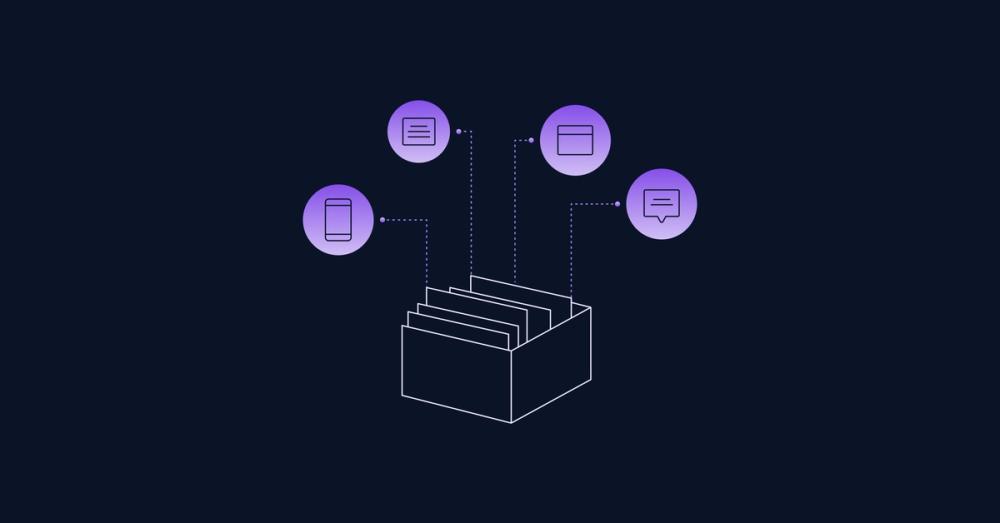
We get our clients to join us working in our toolkit. We prepare boards for each page and request as much of their “final” or real life content from our clients as they can possibly come up with on the spot. Obviously its not final and many ideas are born and or left behind along the way but overall the interactive nature of these sessions help clients to open up to the idea of collaborative ideation.
What starts out as post-it pile often turns into live wireframing sessions to quickly “napkin sketch” the ideas and have everyone comment and update or annotate the drafts. We rarely announce “a great workshop” but instead drag clients into a Figjam and point their cursors at wireframes which help to visualize a common understanding of what will be built with every iteration.
Powerful side-effects, unlocked Link to this headline
This process leads to several impactful side-effects that help us get these kinds of projects done considerably faster than we previously thought possible.
User story gaps are revealed Link to this headline
The product or service in the clients mind is often a story they have started to tell to people and with each time the have told them the story became more convincing. Feedback has helped to even out irritation and friction is simply being left out to deliver a more compelling storyline to potential new customers and investors. We put these stories to the test. Mapping out the clients story into a sequence of interactions quickly reveals points for friction or unclear next steps.
Engaging interactions Link to this headline
Many of the client’s domain experts new to the process of creating digital interfaces are not aware of the variety of interactive UI elements that can be leveraged to solve a specific use case through interaction design . By offering abstract (non interactive) versions of these UI elements we open clients up to the concept of thinking about the desired outcome first and then selecting the right type of interaction to enable an appropriate and delightful interaction.
Consistent calls to action Link to this headline
During the session we frequently ask about the goals or desired outcomes of the users or customers of the product. Identifying these main outcomes and offering a clear call to action for the user to act upon ensures that the product fulfills its basic promise. 🤝 Focusing the experience on these main call to actions reduces overhead and rage clicking to find key actions fast.
Iteration on common ground Link to this headline
Defining the content blocks in wireframes allows everybody to chime in and add their perspective. Having the user journeys mapped out before and the calls to action defined ensures that the content is goal driven and actionable. It’s really the easiest and most efficient point in the website building process to come up with great content: everything else will be build around the consistent stories created here.
Validation > Concept Link to this headline
This is also the first stage in a project where early user testing comes into play. We love testing these first set of wireframes with real users. It is a fast and highly efficient feedback collection process that allows us to skip multiple iterations and refinements until we have more clarity on the basic usability of the experience.
Conclusion Link to this headline
We learned that content driven wireframes typically go through less cycles of revision and eventually become the guiding star for the project. They help to align stakeholders constantly around the common themes of navigation, content and conversion. And best of all? We’re skipping the part where the website setup is sitting readily available on a test deployment for weeks, till the content is signed off and added to the content management system!
We made building marketing websites a breeze for our clients, the marketeers and for ourselves. Big shout-out to our clients who are willing to take part in this process!
We’re curious about your perspective as a client: Have you participated in the early conceptual steps of product design through wireframing? How did this collaboration impact your understanding and the product’s final result?


