- Information Architecture
- Web Applications
New Dinghy Website Part 2: More structured content

Video Summary Link to this headline
Hey everyone, Nils Borgböhmer here again, back with another update on our journey of rebuilding Dinghy's website. In my last video, I talked about using structured content and Sanity in our project. Today, I'm excited to share some insights on how small changes can have a significant impact on our website's functionality.
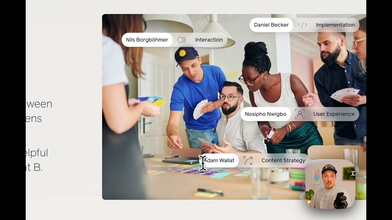
We've recently renamed some of our areas of expertise. What used to be 'branding' is now 'design', 'interaction design' has become simply 'interaction', and 'development' has been changed to 'implementation'. These might seem like minor tweaks, but they're linked to various elements across our site, making this update quite crucial.
I anticipated a lot of manual work to update these changes throughout the site. However, I want to show you how seamlessly everything integrates thanks to our content management approach. On our website, the information from two different collections of reusable content is used in various places, like team member names and labels for our areas of expertise. This is evident on pages like our 'About' section, where these categories are displayed.
For instance, when updating our 'About' page, we don't type in information manually but select from predefined options in our collections. Let's say I replace my name with Daniel's for this demonstration. All the related information updates automatically on the page, including the areas of expertise. This is because all details about our team and expertise areas are stored in dedicated collections and exist only once.
So when I wanted to update the name from 'development' to 'implementation', it was already done, as I had changed it in the areas of expertise collection. This automatic update is incredibly convenient, especially for small teams like ours. It allows us to move quickly, stay consistent, and maintain our brand identity without extra effort.
Another exciting feature I want to share is a page we've created about our tech stack at Dinghy. This page categorizes the tools we use, and by clicking on a category, others blur out, highlighting the chosen one. This page is structured similarly, with a dedicated list for all the tools we use, each with a title, logo, and tags. These tags are also a separate collection, used across different contexts like blog posts. So, if we change a tag name, it updates everywhere – on the tech stack page, blog posts, everywhere.
This level of interconnectedness and convenience is not just beneficial for small teams. It's a powerful asset for any organization aiming for efficiency and consistency.
I'll be back tomorrow with another update, hopefully about another exciting part of our site. I hope you're finding these videos helpful and informative. Let me know your thoughts , and let's all stay productive!


