- Accessibility
- Data Privacy & Compliance
- Information Architecture
7 things you can do to improve your signup form

Sign up for something every day Link to this headline
Let’s face it, the internet is a massive registration business. Sign-up forms are everywhere and in most scenarios, they are the number one needle hole through which all leads and prospects have to squeeze eventually into your marketing funnels…
If this is such an important part of everyone's funnel, why is it not designed with the same love and attention to detail that the rest of your product was crafted with?
Sign-up forms are often hard to use and way too demanding. This is an unavoidable step that all your leads will have to endure to become your customers. Let’s make sure they sign up happily and feel reassured that they are leaving their data with a responsible company.
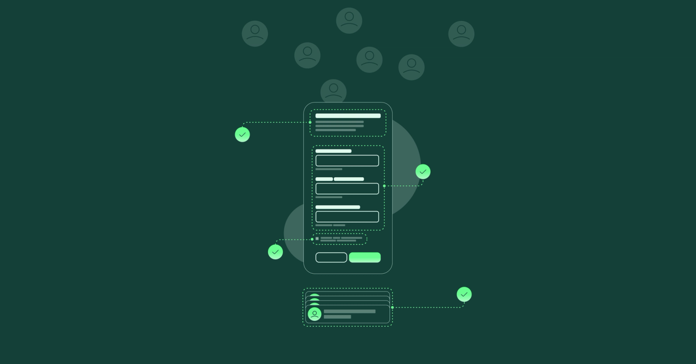
Here are 7 things you can do to improve your sign-up form instantly. This will not only increase your form's usability but will result in more completed forms sent your way.
#1 – Only ask for the bare minimum data Link to this headline
We know it's tempting, all these things you would love to know about a lead to better segment and serve relevant ads and services to them. But the result is a form (even if most of the fields are not mandatory) that looks and feels like a lot of work. Reduce and remove where you can to lower the mental barrier for leads to sign up.
Pro Tip: Instead, try to nudge people to complete information in their account for coupons, special offers or pro-longed trial periods.
#2 – Highlight costs & benefits up front Link to this headline
Remember how suspicious you were the last time when signing up for a new service? Your Leads need reassurance that there are no unexpected costs or commitments involved when trying out your solution. Transparency not only results in more trial users but often builds trust ahead of the experience.
#3 – Manage Expectations Link to this headline
Share the time and Information required to complete the form. Let them know in advance so that they can come prepared and willing to offer the data you are asking for. Nothing is worse than having to look for data and taking much longer than expected to start signing up for a product you might be excited about right about now.
#4 – Remove distractions, focus attention Link to this headline
Many high-performing products remove their main Navigation and any other distracting elements like Pop-ups, footers or additional content to focus their lead's attention on data input and form submission. Any content in this section or on the page has to be directly related to the form.
You can offer reasons to sign up or a motivating brand visual but only if this helps to nudge form completion. Don’t offer links to other resources or topics to navigate away from the current journey.
#5 – Make your form accessible to everyone Link to this headline
Luckily the web can be experienced by people with limited or no eyesight and other severe physical limitations thanks to assistive technologies. Yet more often than not, websites and services are not optimized for these special requirements. This creates very frustrating and often unusable experiences for these users. Optimizing your form for these technologies will allow an additional 10-20% of potential customers to access your product or service.
By ensuring the form elements are structured correctly and labelled in a way, they can be read out loud or navigated through with assistive technology. This will enable many new users to sign up for your service.
#6 – Share how private data will be used Link to this headline
Data privacy is a huge concern for many people and is already protected by legal frameworks like GDPR in Europe and CCPA in the US. Acting in compliance with these regulations removes a lot of uncertainty for your leads and protects you from lawsuits against misuse of personal data. Every data point is a responsibility that you are being entrusted with. By communicating the ways in which you intend to use the data, you are sharing important factors to decide to opt in.
#7 – Enable social login and Auto-Fills Link to this headline
Allowing your leads to log in with their existing social credentials, (like Google, Facebook or LinkedIn accounts) will boost your sign-up numbers.
Studies show that allowing users to log in with their existing credentials significantly increases the likelihood of them registering for your service, compared to requiring them to complete a new sign-up form.
If Social Logins are not suitable for your organization, you can still permit auto-fills to enable quickly filling a form with information saved in the lead device or browser. Auto-fill features enable customers to quickly complete extensive sign-up forms in mere seconds instead of minutes, significantly enhancing the potential for higher conversion rates on your registration forms and pages.
Implementing these strategies will improve your form significantly. By auditing your current form and considering ways to improve it, you are well on your way to changing the way you build and deliver these forms to your customers in the future. Make them exciting and level up your funnel game!
More forms successfully send = more potential leads in your pipeline = higher chance of new customers = more profit. Improving your customers ' experience has a great ROI!
